Naming, identity, and packaging for Ético, a new concept retail store, providing fair trade and environmental friendly products from around the world.
Naming, identity, and packaging for Ético, a new concept retail store, providing fair trade and environmental friendly products from around the world.
Recycled
Traded
Sustained

Ético Supermarket
DISCIPLINE
Art Direction
Branding
Packaging
DESIGN TEAM
Tien Pham
Ken Hwang
Yier Chang
Kendra Monterrosa
BACKGROUND
As a team, we were asked to create a brand identity for a new retail store with an extensive corresponding product line. We created Ético, a concept store based in Berlin. Our objective was to inspire and educate future generations to shift towards an environmentally and conscious future for our planet, which faces problems such as pollution, waste and unfair labor practices.
APPROACH
Ético uses a wide range of ecologic and recycled materials, paired with a clean yet impactful label design representing the great diversity, innovation and character of a truly sustainable design.
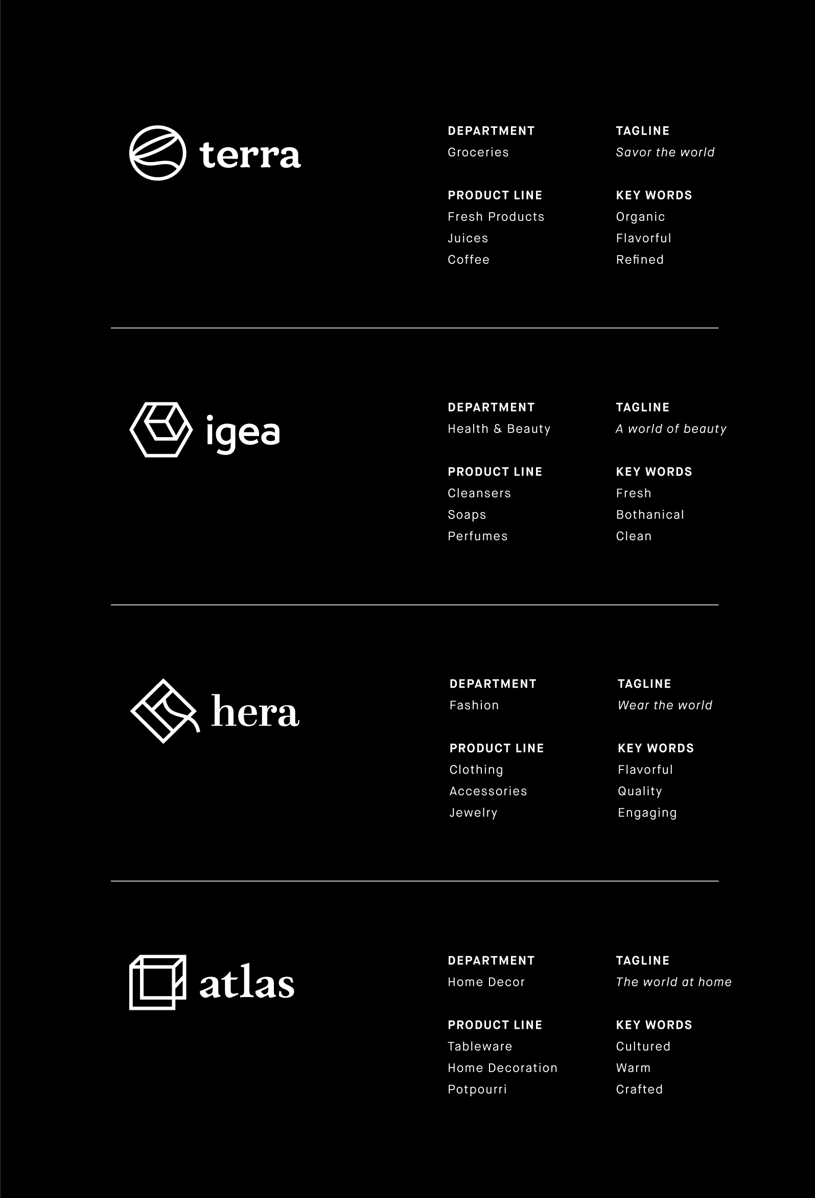

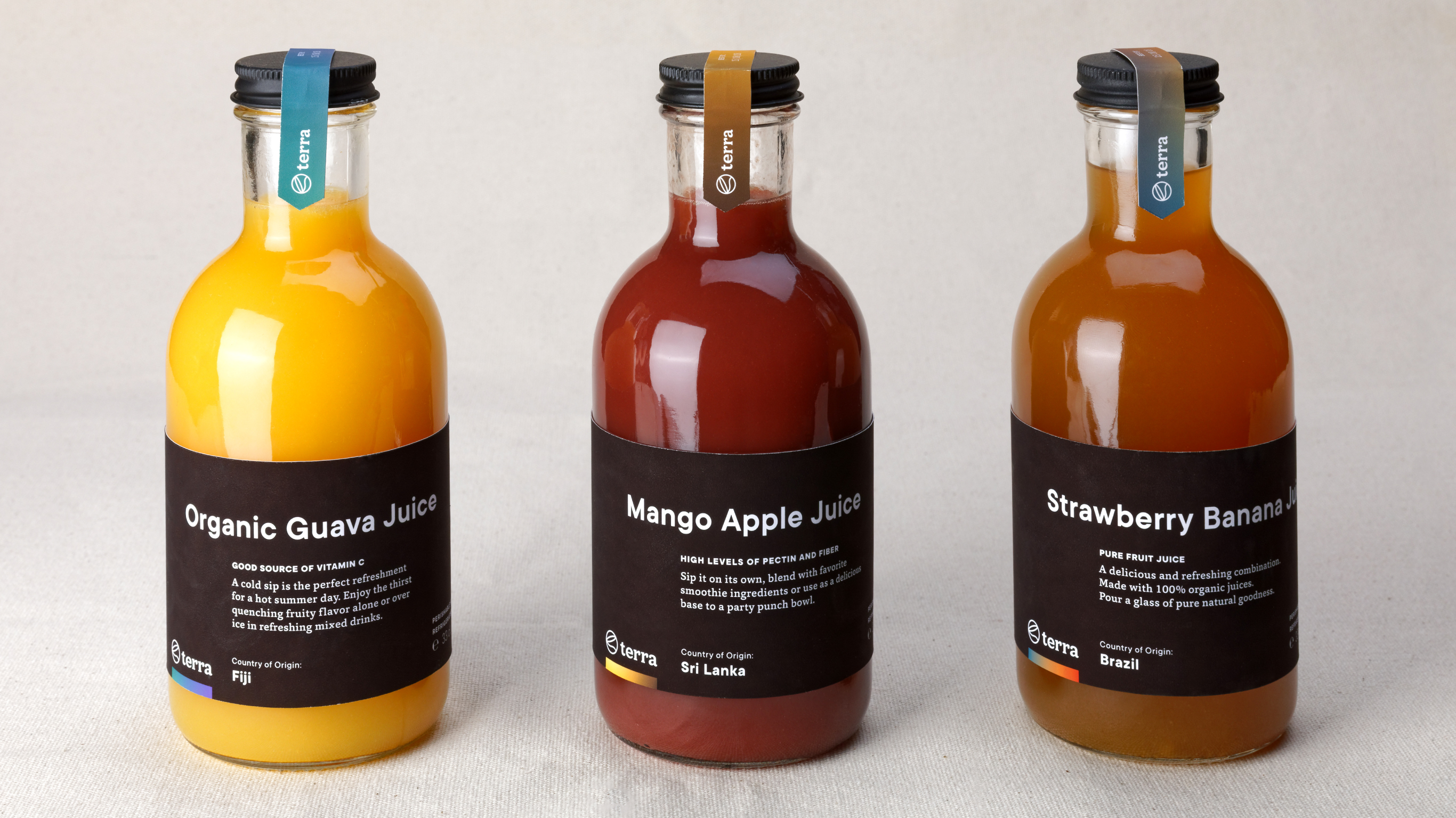
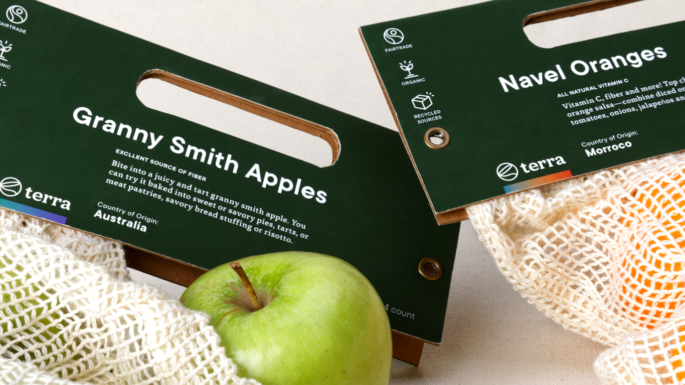
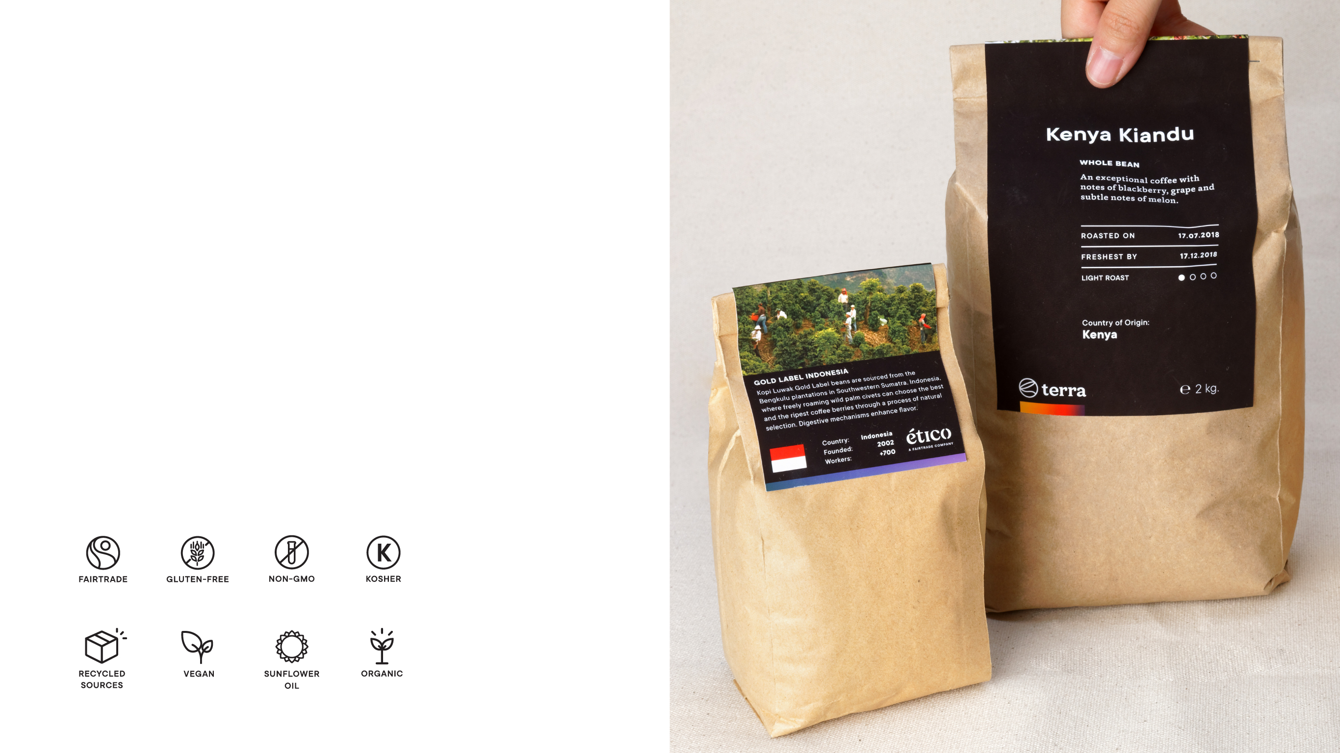
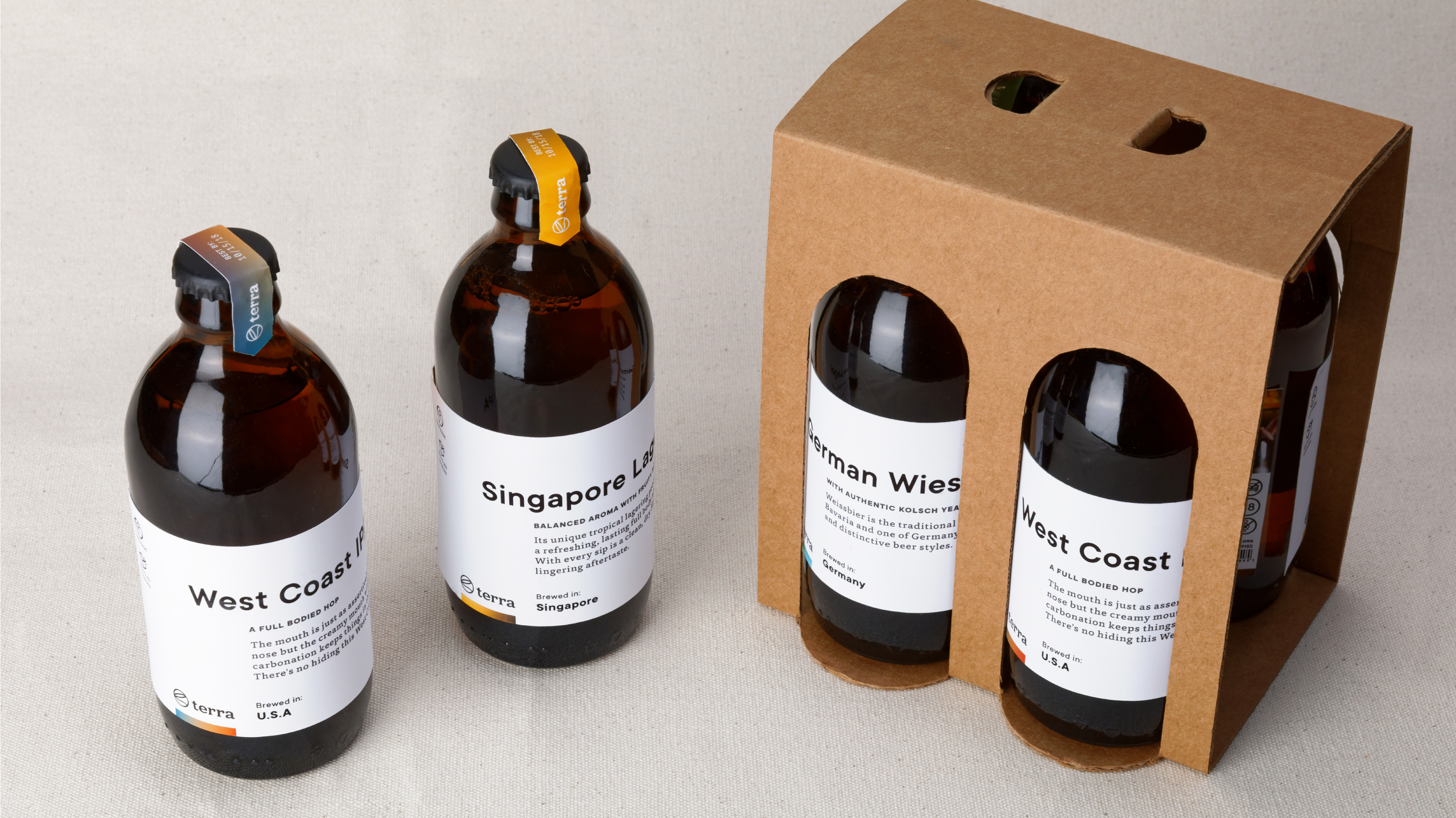
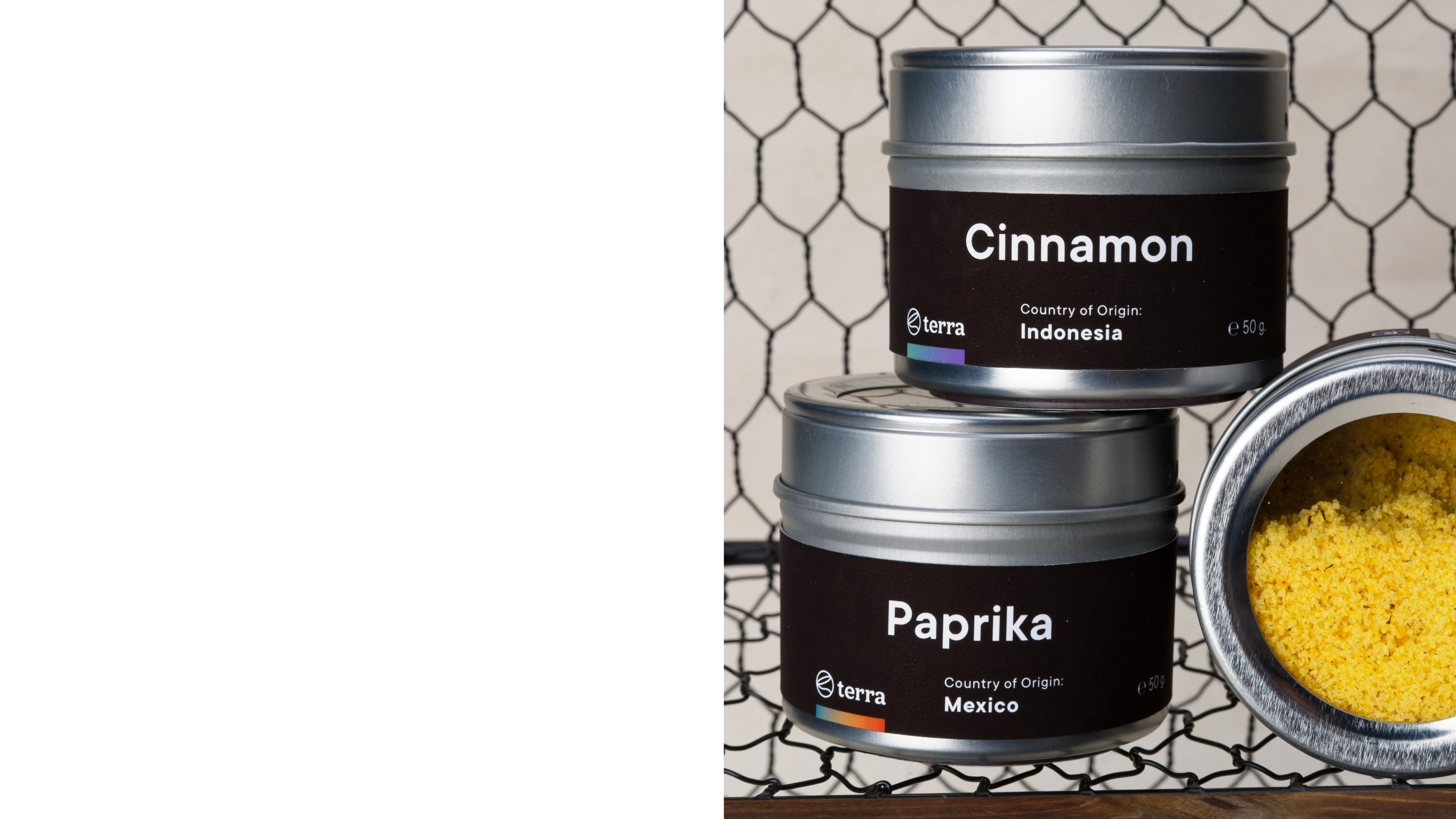
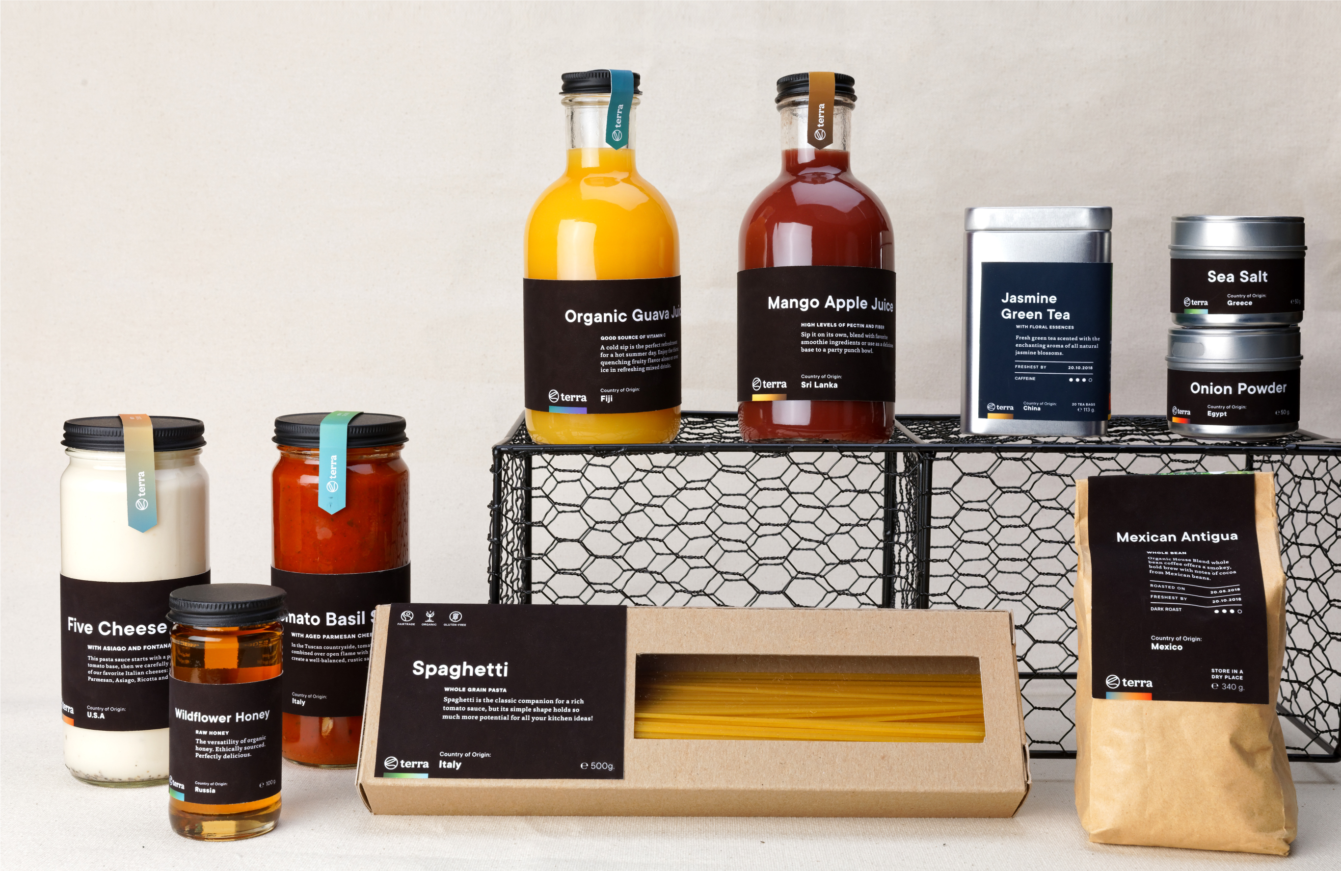
Terra
KEY WORDS
Organic
Flavorful
Refined
TAGLINE
Savor the world.
BACKGROUND
Terra is the food line Ético offers, and it carries a wide selection of fair trade products. Terra wants to help guide your taste buds around the world with our thoughtful packaging and quality primary ingredients.
APPROACH
Our objective was to encourage consumers to shop with a sense of trust, knowing exactly where the product comes from and who made it. Terra’s typography-driven labels create a sense of balance in the design that aims to be informative, trustworthy and honest.
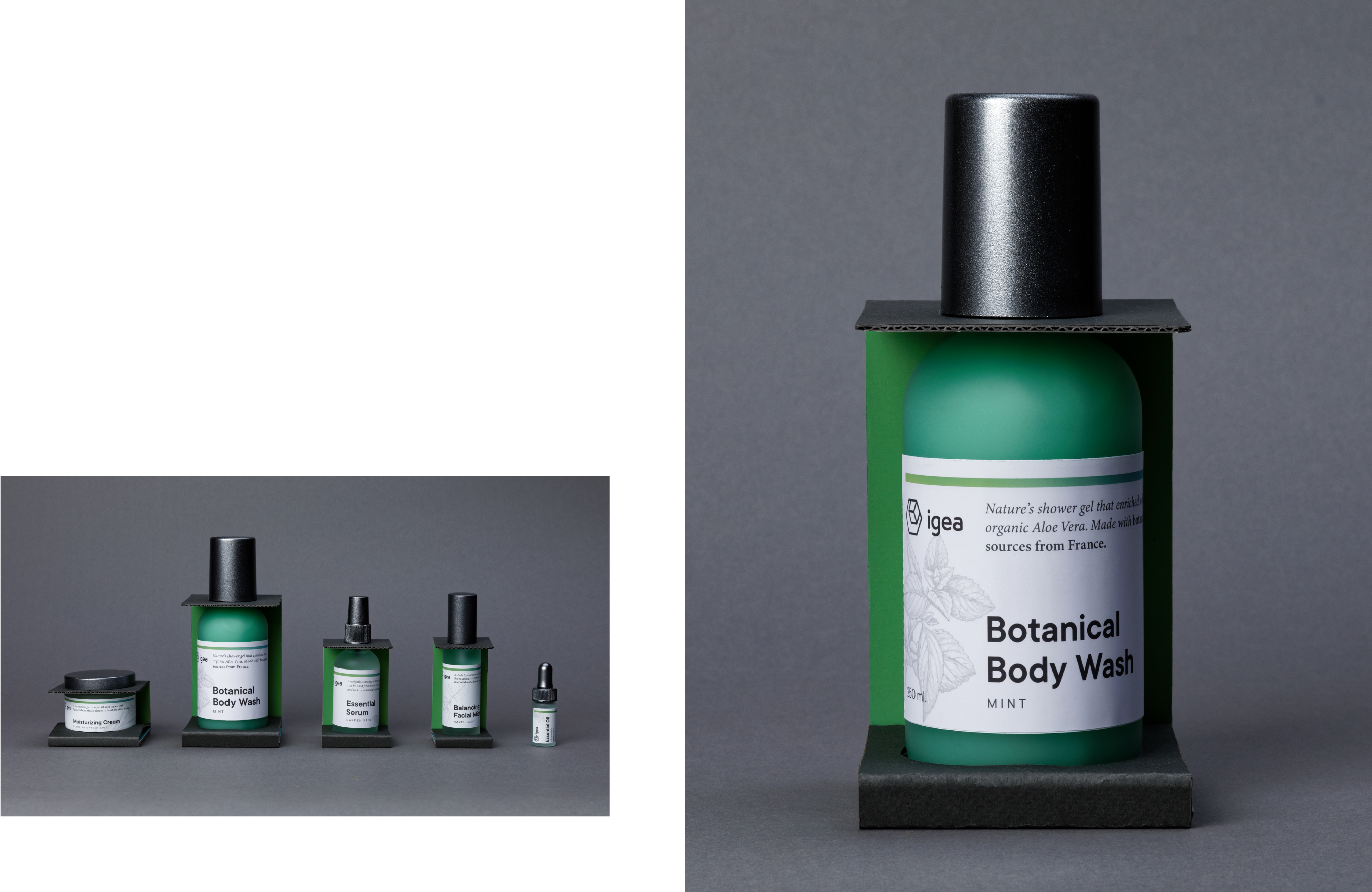
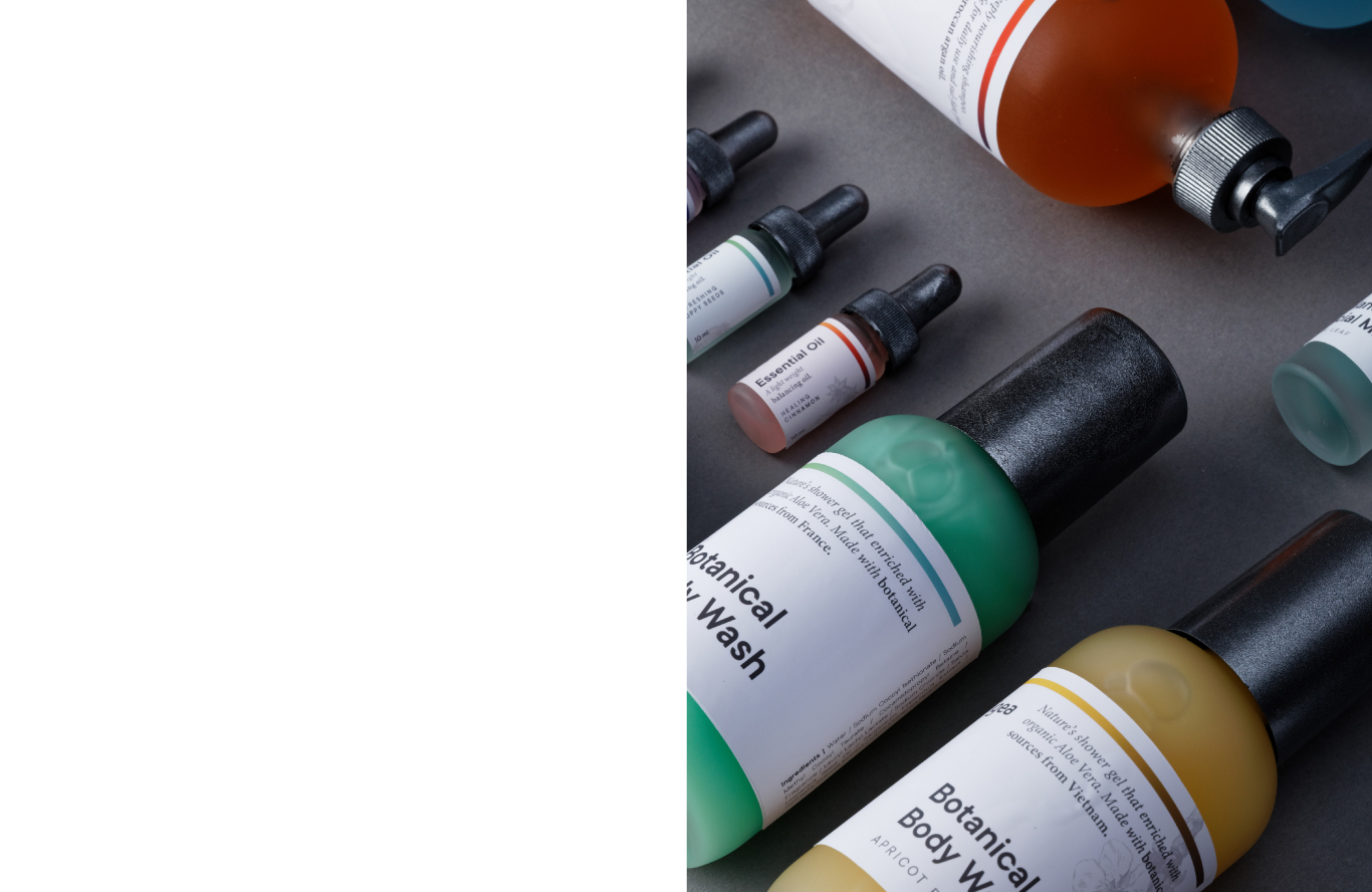
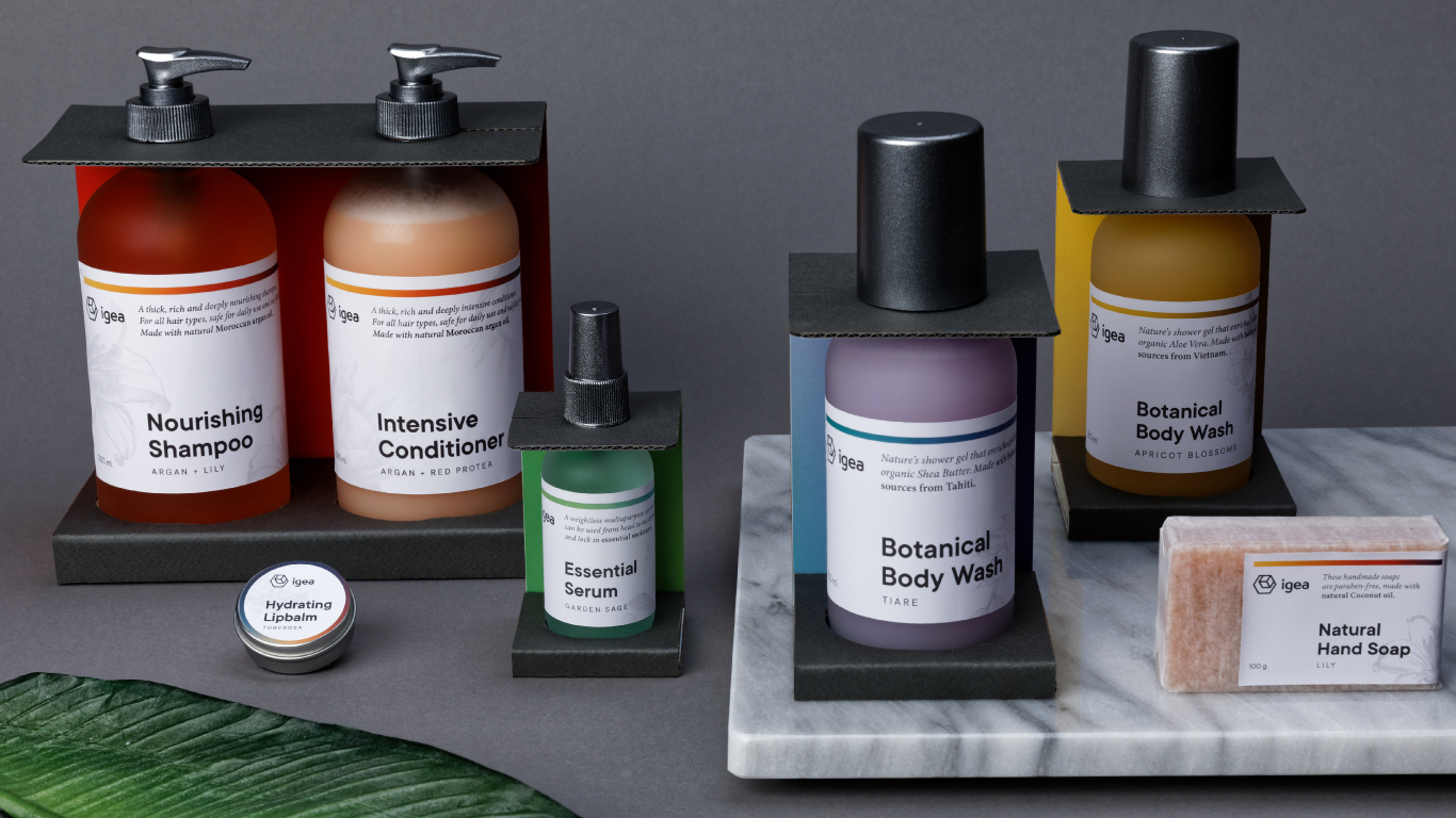
Igea
KEYWORDS
Fresh
Botanical
Clean
TAGLINE
A world of beauty.
BACKGROUND
Igea is the health and beauty line that centers itself around all things natural to better yourself inside and out. It is the pinnacle of fair trade skincare, and it is intended to ensure a healthy complexion with a colorful line of staple products.
APPROACH
Igea features a cohesive line of plastic-free products inspired by botanical elements. The label’s simple typographic expression, paired with botanical drawings, delivers information immediately with a thoughtful hierarchy of content.

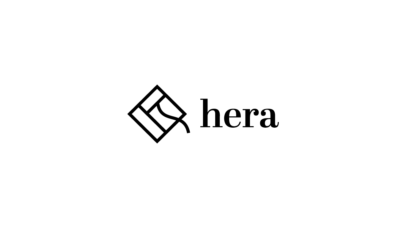
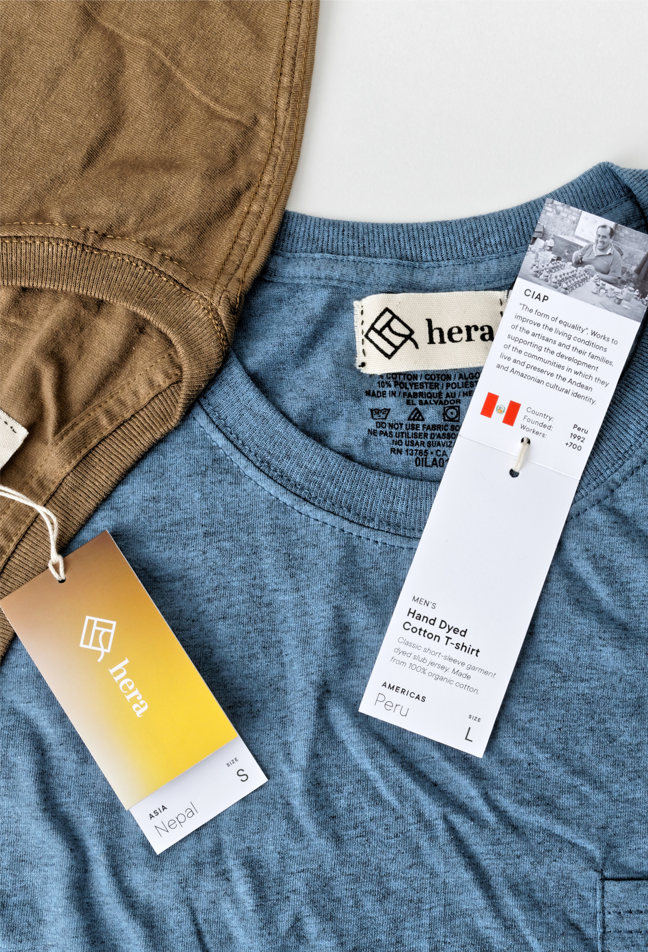
Hera
KEYWORDS
Flavorful
Quality
Engaging
TAGLINE
Wear the world.
BACKGROUND
Igea is the health and beauty line that centers itself around all things natural to better yourself inside and out. It is the pinnacle of fair trade skincare, and it is intended to ensure a healthy complexion with a colorful line of staple products.
APPROACH
Igea is the health and beauty line that centers itself around all things natural to better yourself inside and out. It is the pinnacle of fair trade skincare, and it is intended to ensure a healthy complexion with a colorful line of staple products.
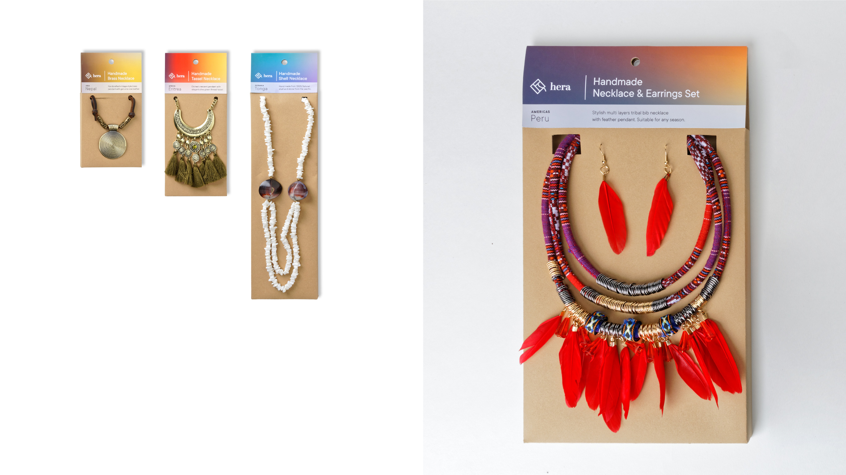
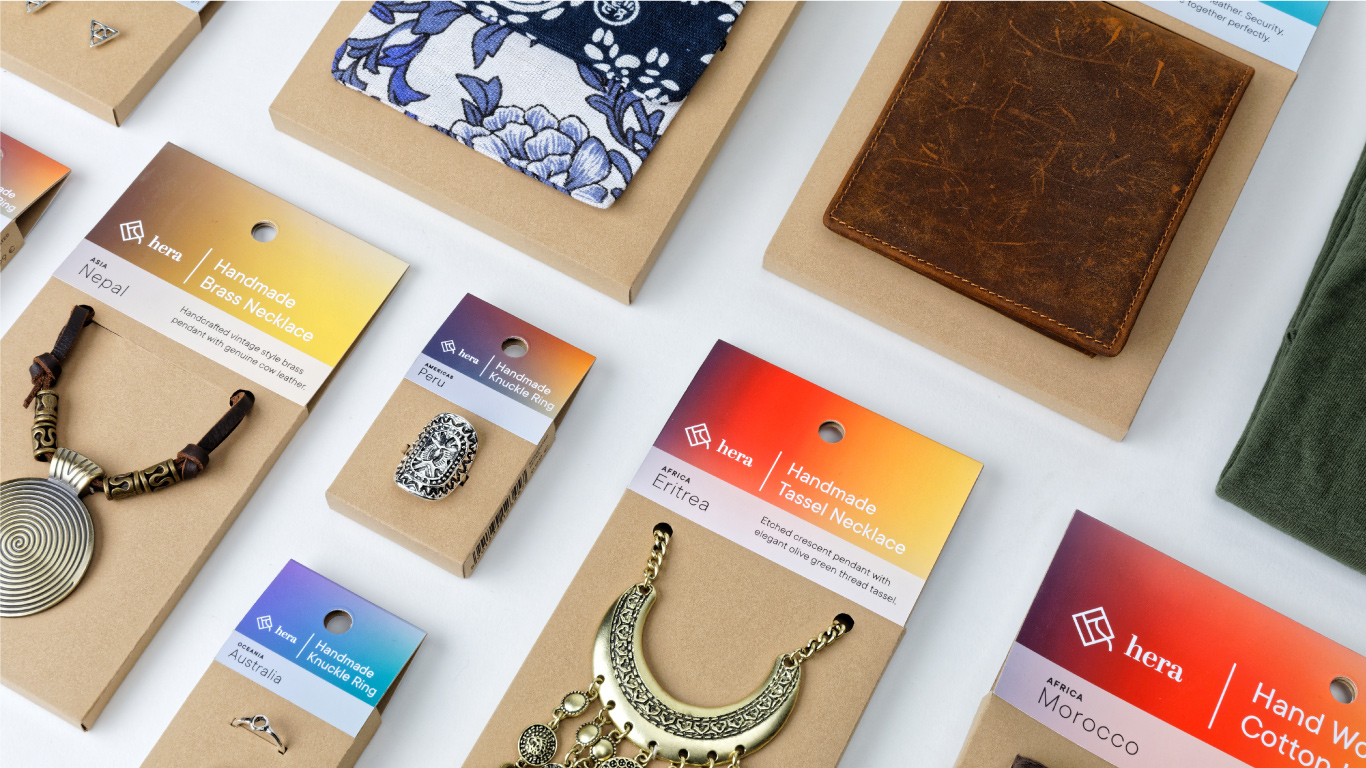

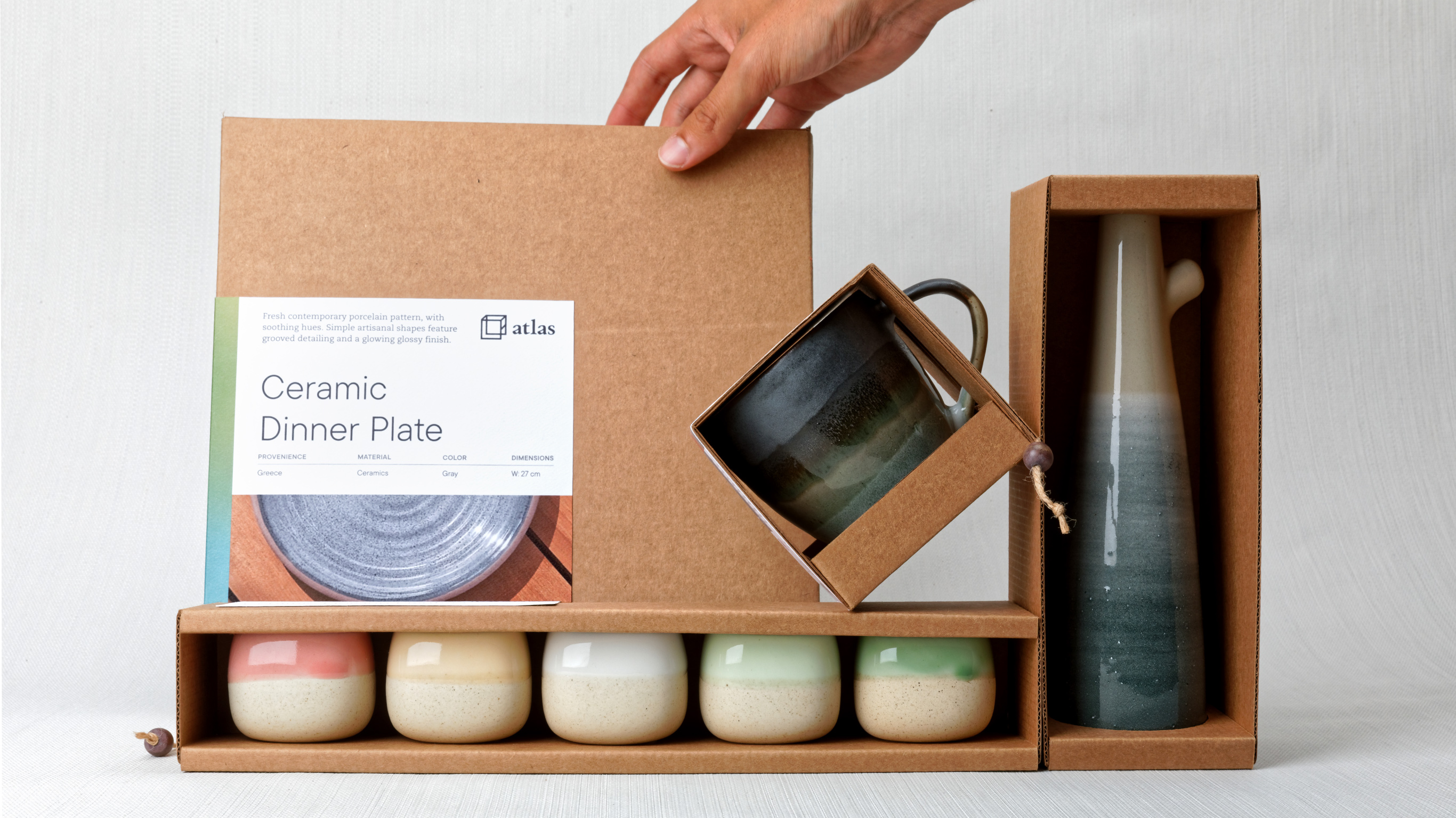
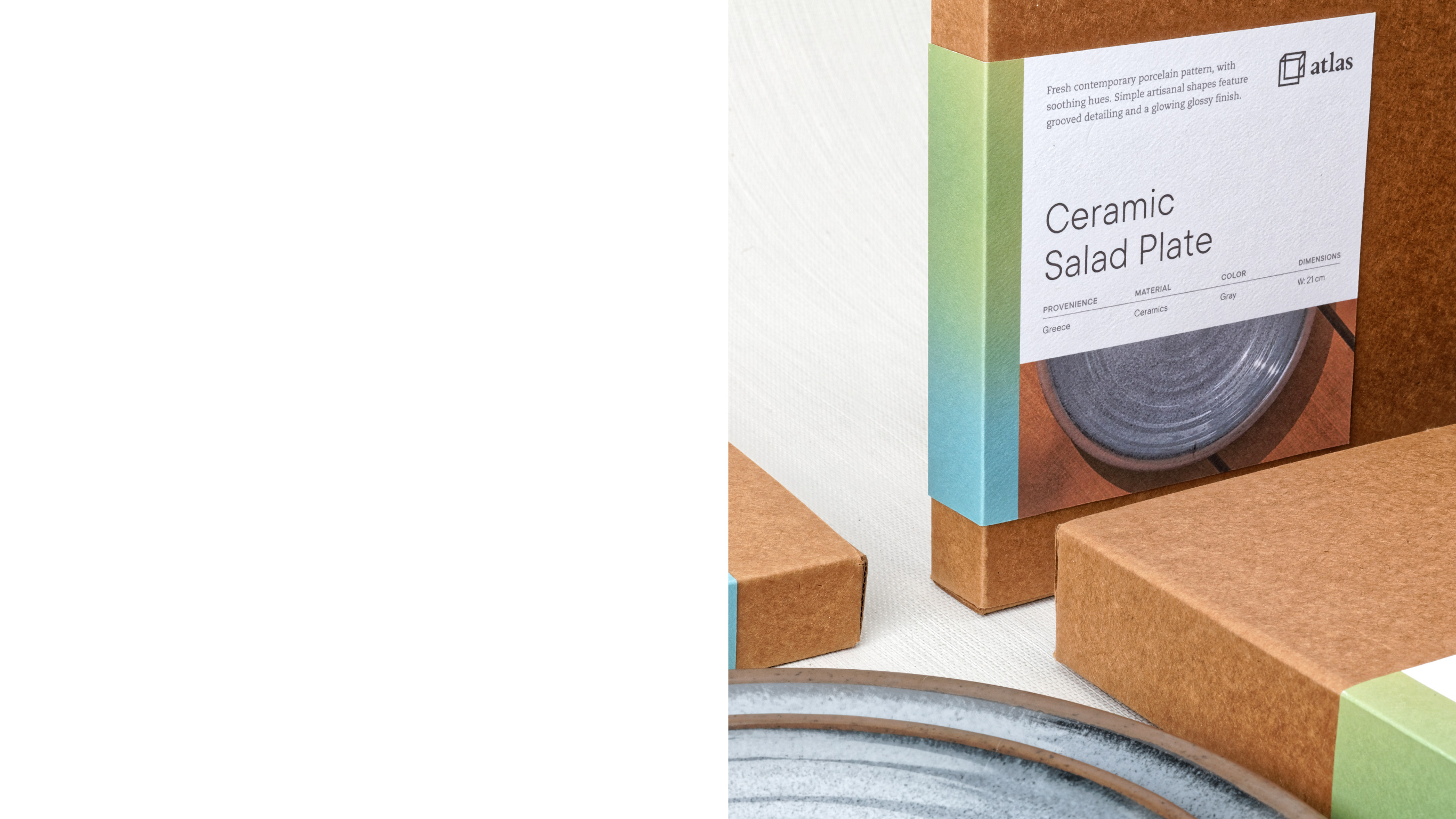
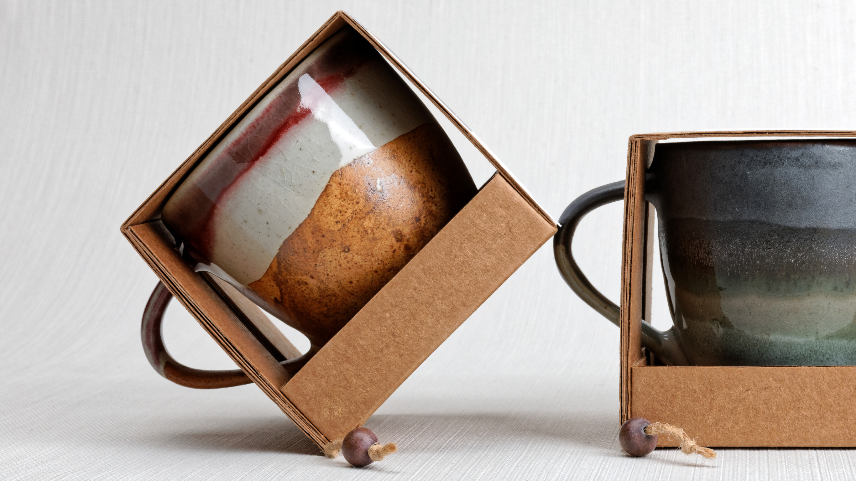
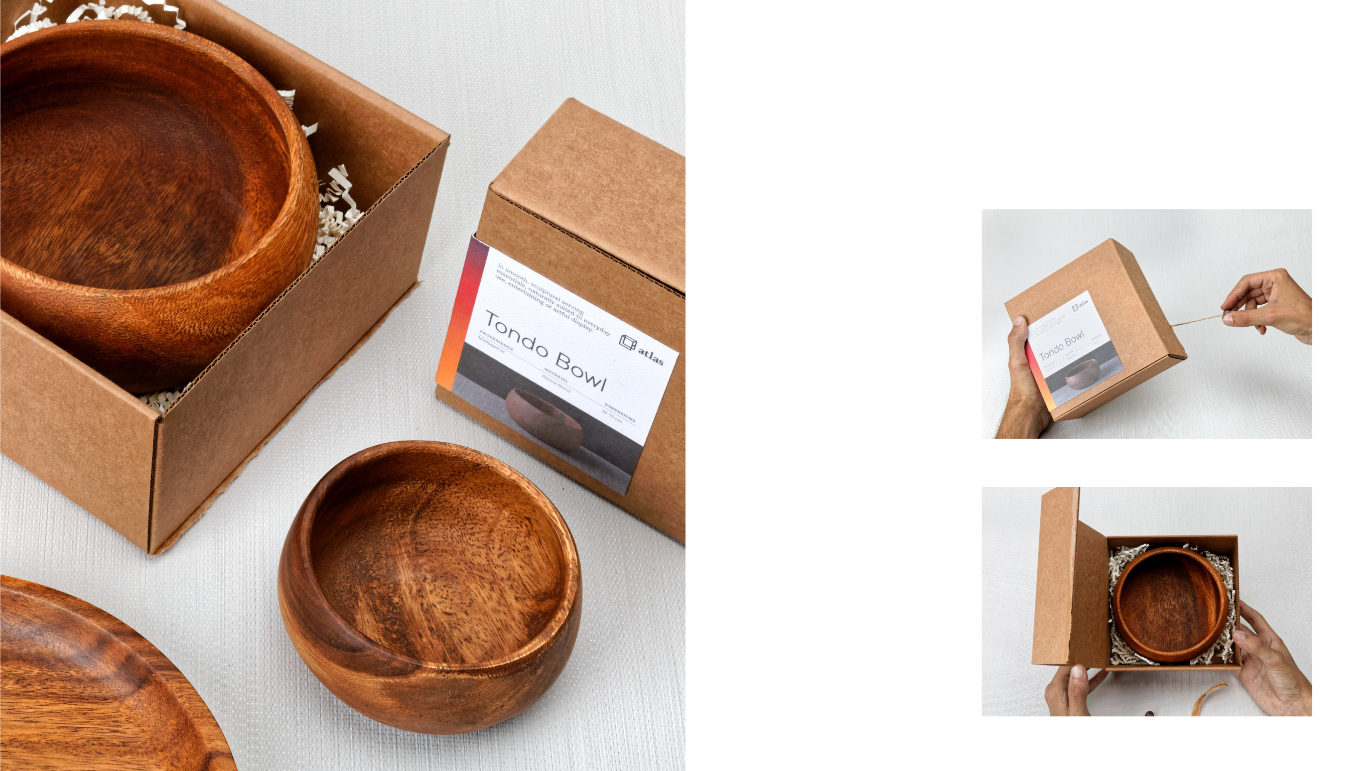
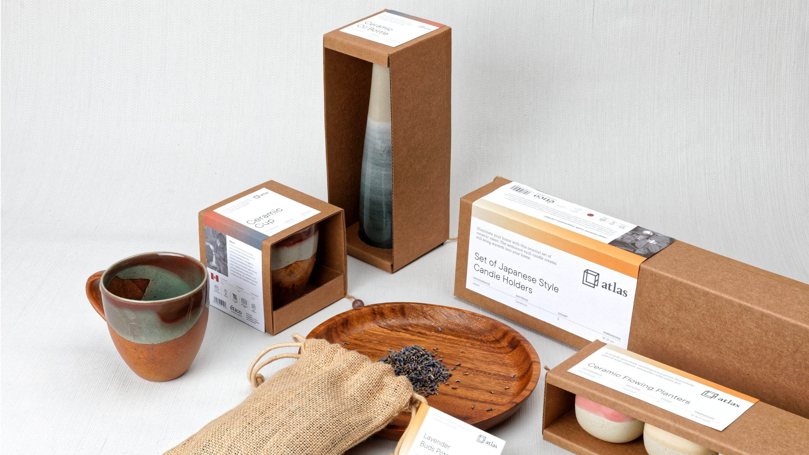
Atlas
KEYWORDS
Cultured
Warm
Crafted
TAGLINE
The world at home.
BACKGROUND
Atlas is the homeware and interior decor line. It brings new and uncharted territories home by collecting pieces of the world and the stories they have to tell. It is characterized by cultured aesthetics, craftsmanship and functionality.
APPROACH
The idea behind the design was to create a simple, raw, and direct experience for the customer. To minimize the environmental impact and save costs, every packaging structure is engineered to be built from single sheets of recycled cardboard without the need for glue.

Selected Works

YOLOArt Direction, Branding, Product Design, Production Design, Styling

Global ExpressBranding, Production Design
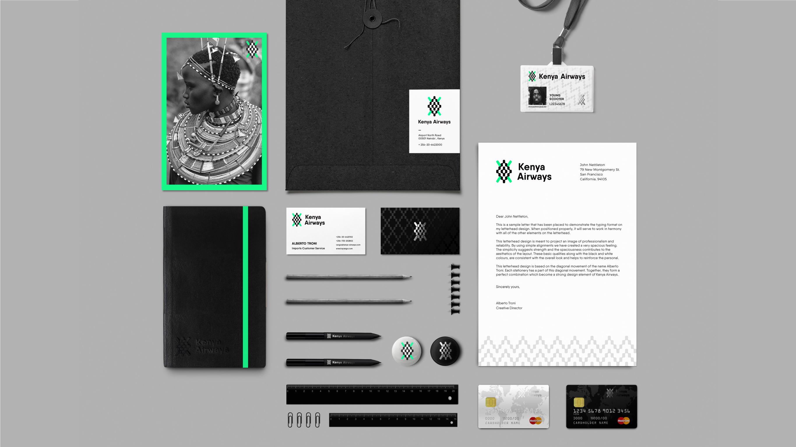
Kenya AirwaysBranding
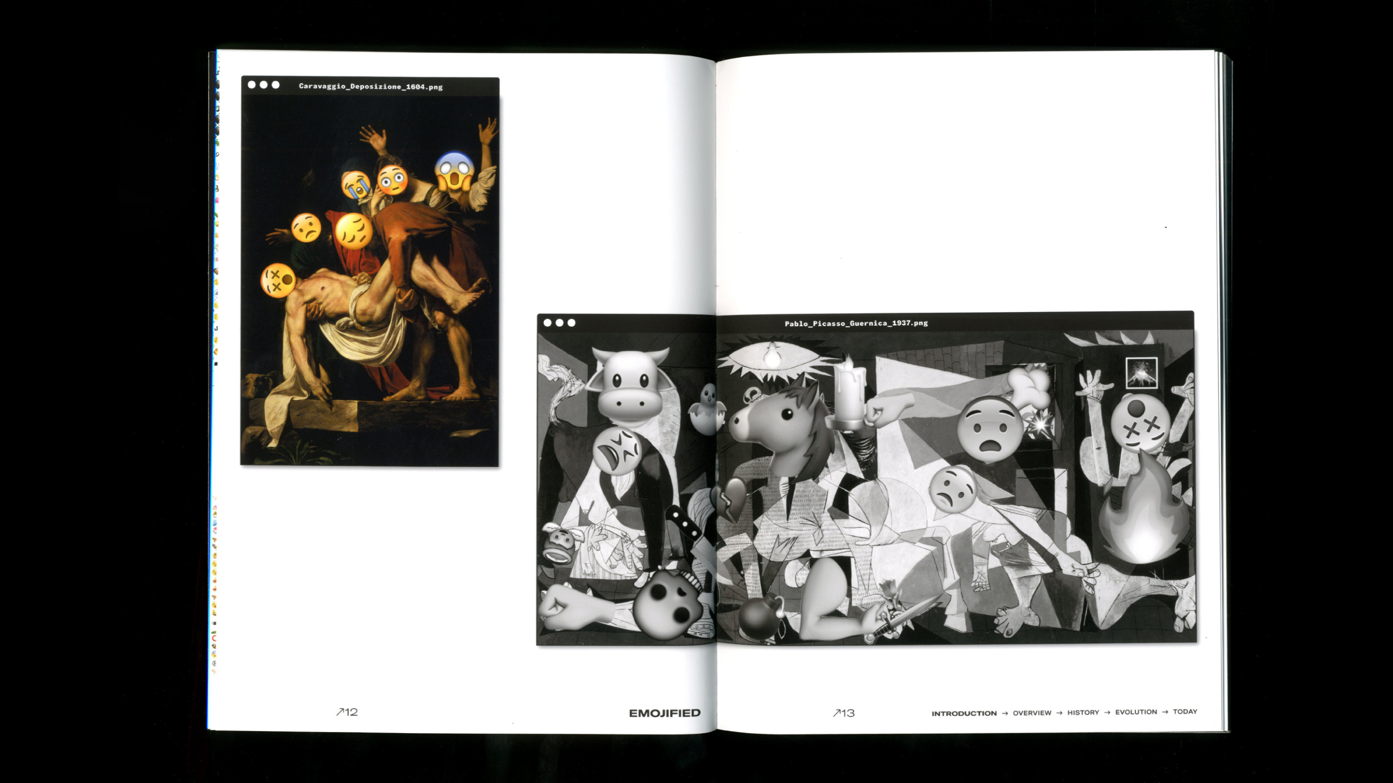
Emojified ConferenceEditorial Design
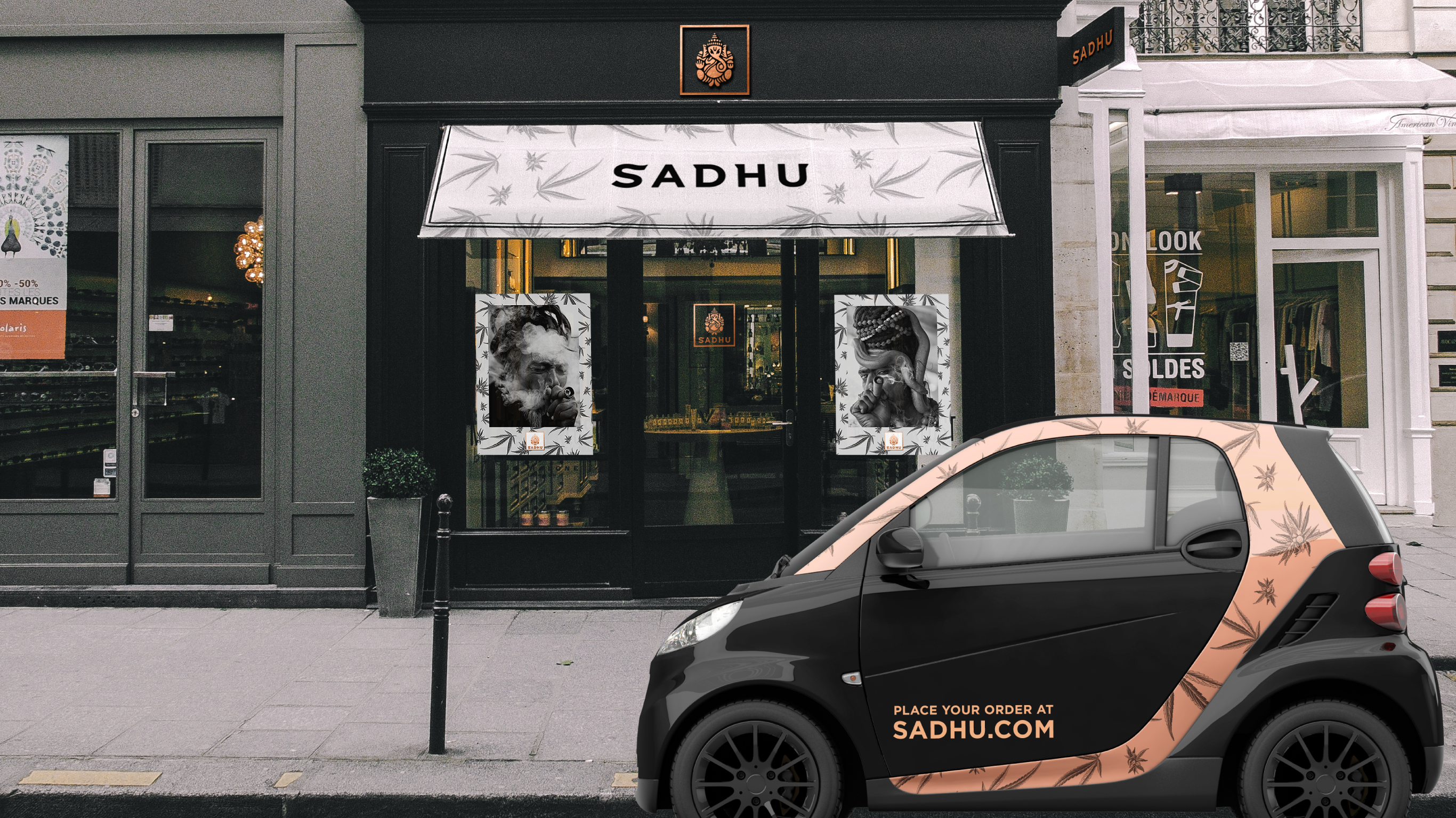
Sadhu DispensaryBranding, Packaging
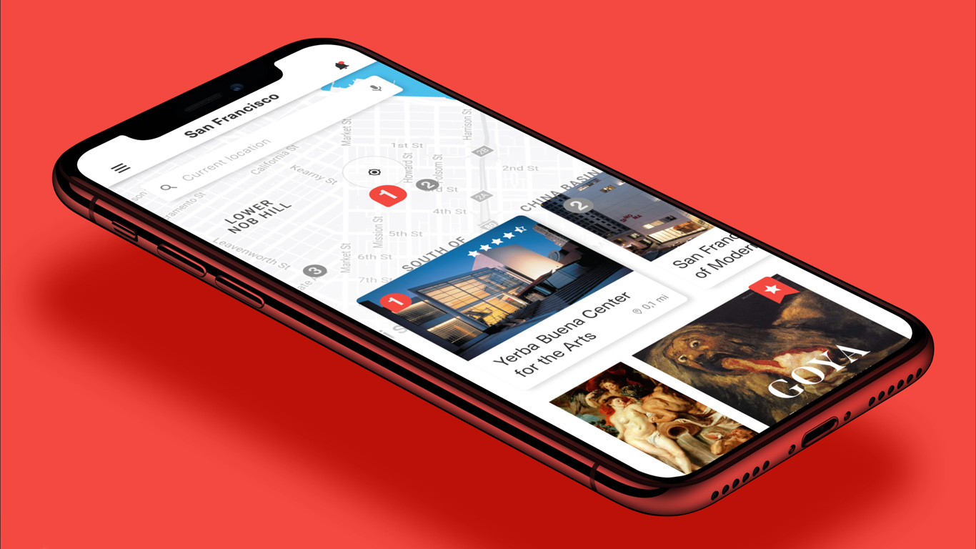
Muzeums Mobile AppUI/UX
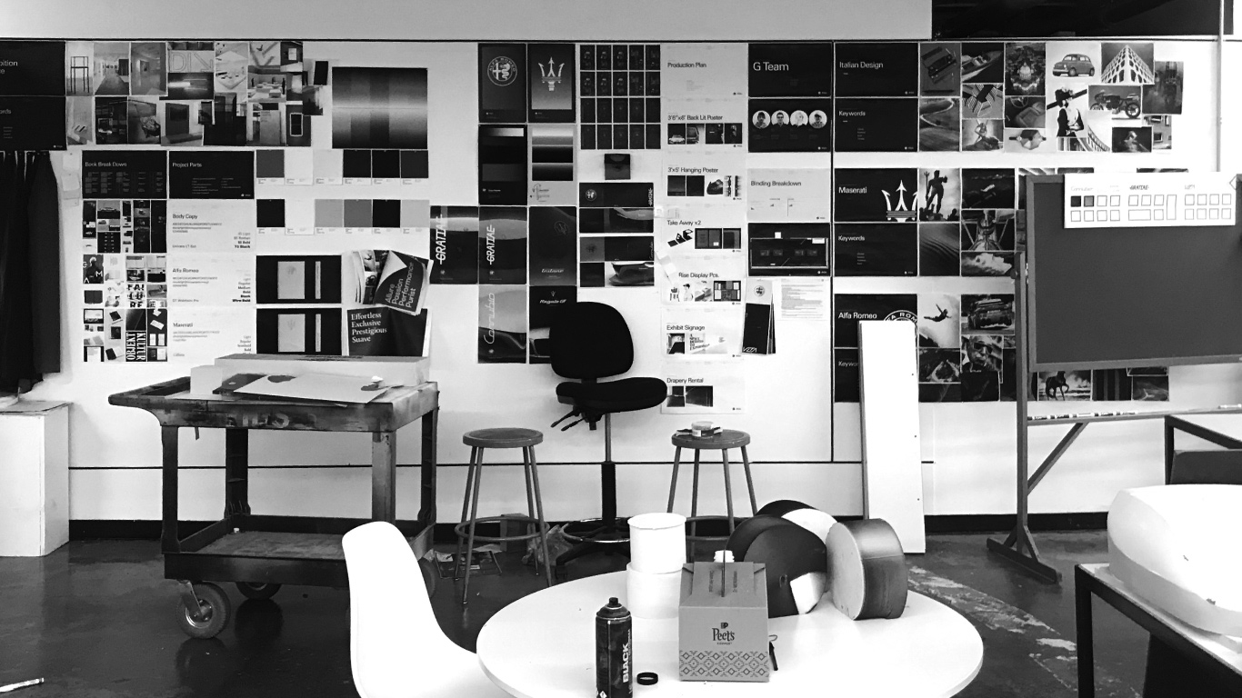
FCA Sponsored ProjectCreative Direction, Exhibition Design, Editorial Design
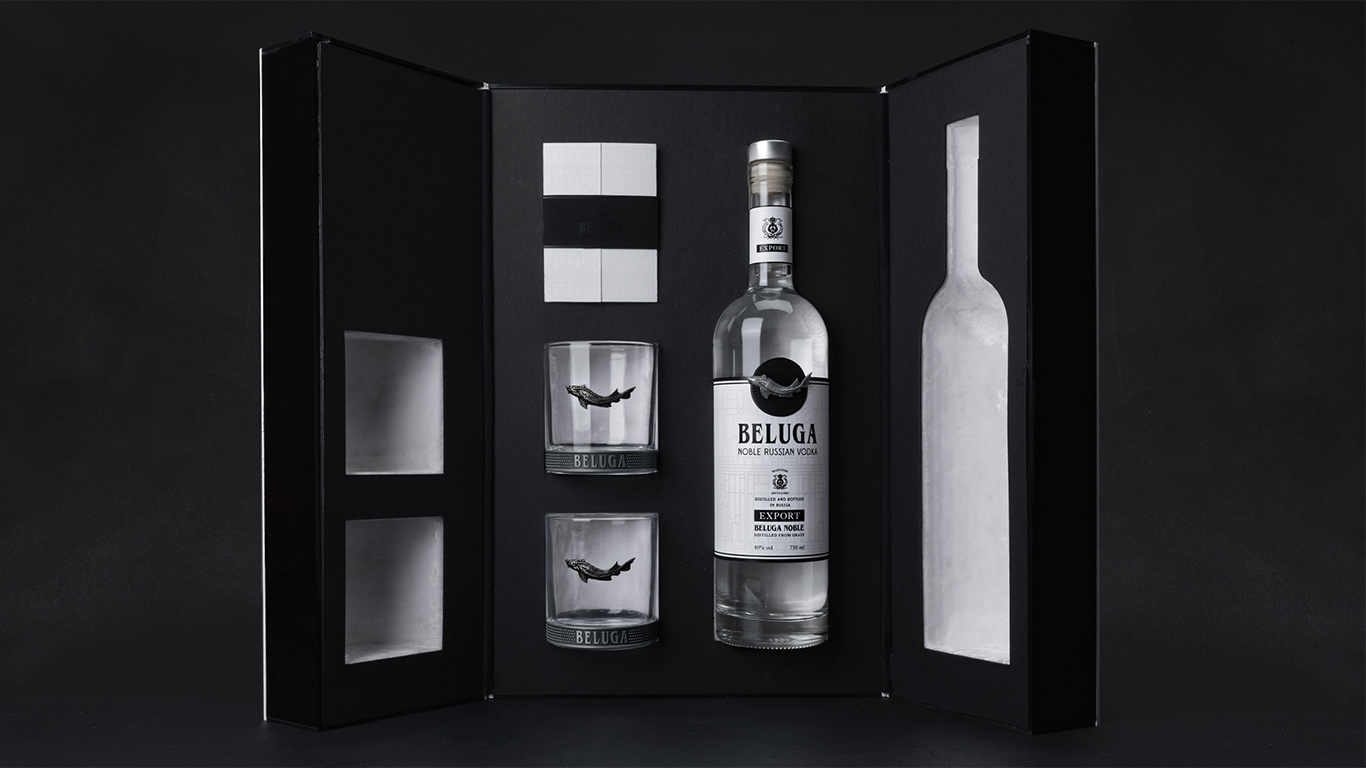
Beluga VodkaPackaging

Pasta CookbookEditorial Design
© Alberto Troni 2018